Commercial Design Awards
Commercial Design Awards Winner: The Falcon Apartments
When two Glendale High School alums, TLC Properties owners Sam and Jen Coryell, purchased land near their alma mater, they knew Nathan Taylor with Obelisk Home would be able to create a modern, upscale community hub that pays homage to the school.
By Ren Bishop
Jul 2019
WINNING DESIGNER: Nathan Taylor, Principal Designer at Obelisk Home
Four years ago, two Glendale High School alums purchased land near their alma mater. The apartment complex they built, designed by Obelisk Home, pays homage to Glendale while creating a modern, upscale community hub.
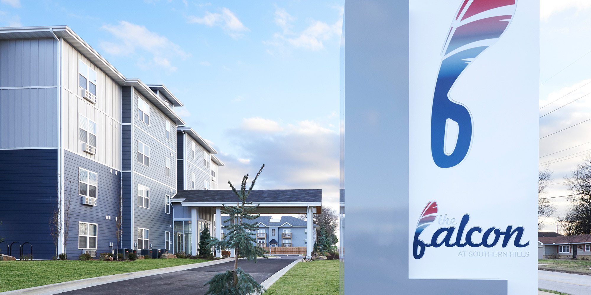
TLC Properties owners Sam and Jen Coryell bought a parcel of land in east Springfield, just down the road from Glendale High School. The pair had attended the high school and knew the potential in its nearby neighborhood. With a vision in mind, they sought out Nathan Taylor at Obelisk Home to execute their dream. “The impetus of the name, The Falcon, came from Glendale,” Taylor says. “So what we did was start with a logo and actually create the feather for The Falcon that was relatable to the area, so that it was a part of the neighborhood.”
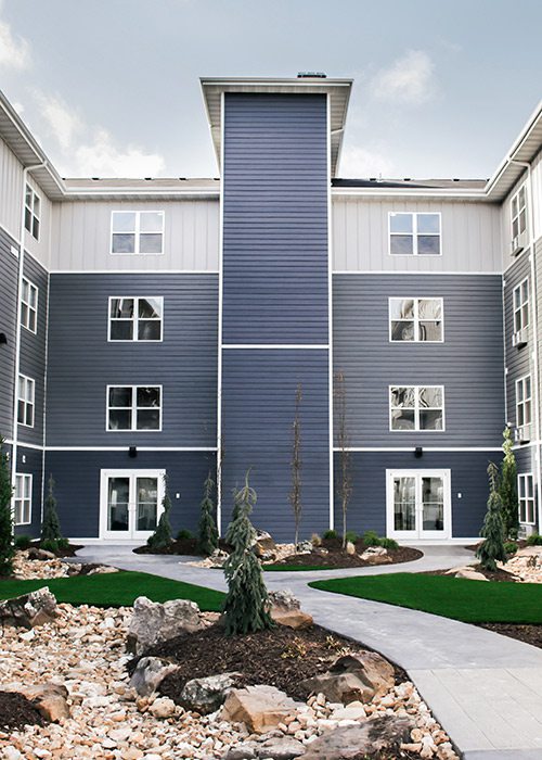
Through multiple design iterations, Taylor and his team at Obelisk Home worked with H Design, the complex’s architects. Together, they designed the complex in a U shape and grounded it with a large courtyard at its center. The crafted outdoor space creates a sense of a modern, thriving community. “We wanted it to feel like a small community, so creating a gathering space was super-important,” Taylor says. “We wanted residents to talk to their neighbors by encouraging a sense of community, so they would interact with each other.”
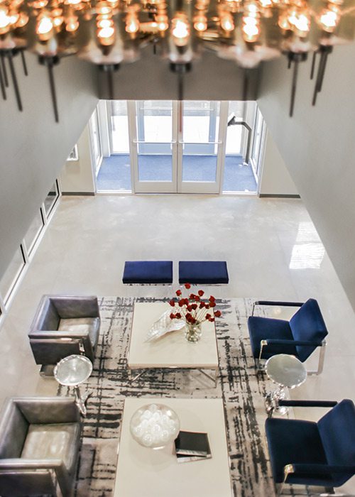
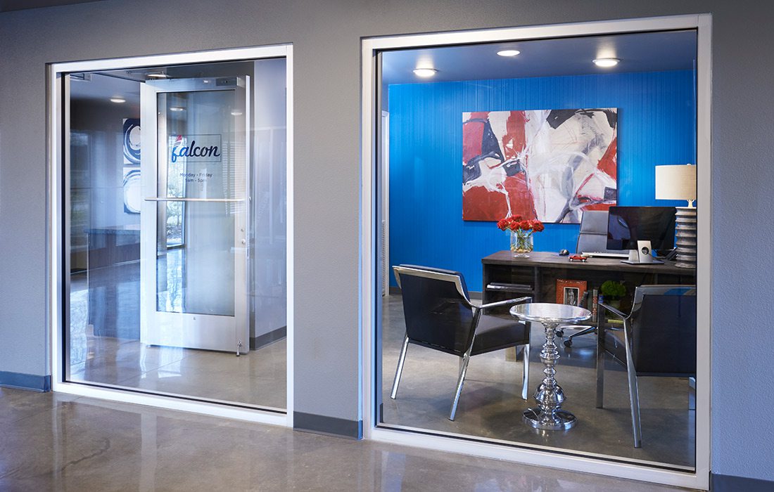
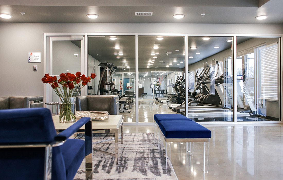
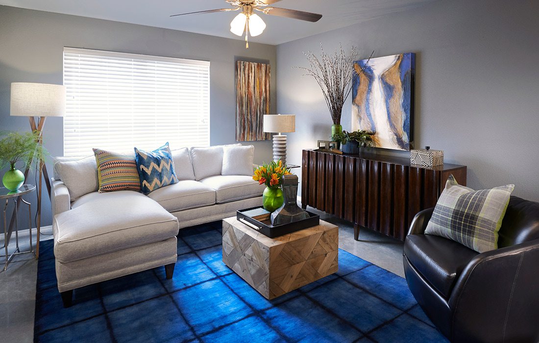
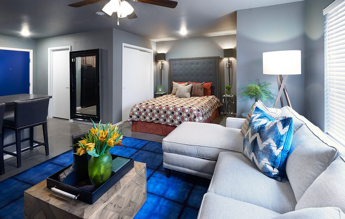
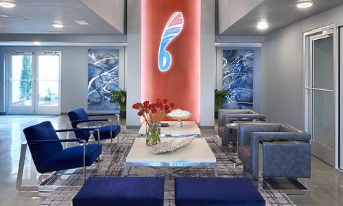
Sidewalks in the courtyard meander around the property, and benches are placed strategically to create intimate spaces for conversation in its dog park. Inside, the lobby is intended to feel like a lounge, with glitzy chandeliers, plush seating, glass walls and expansive windows, all of which invite residents to come in and relax. “We wanted the common spaces to feel like an extension of your home,” Taylor says. In the common spaces, a neon sign of The Falcon logo glows. Taylor loves the pop of Falcon red on a wall, and the soft blues inside echo its blue, gradient exterior. The complex’s modern vibe, he hopes, will attract young professionals to live and stay on the east side of Springfield—part of the mission behind the apartments’ design, he says.
“I wanted the design to feel like we believe in this area, that we believe in the neighborhood,” he says. “We wanted to do something that would take the neighborhood to the next level and not keep it status quo. It’s a great area to live, and the owners wanted The Falcon to be a cool, hip place where young professionals would want to be.”
RESOURCE LISTINGS
Where to find the looks and materials used to create this winning business space in Springfield, Missouri and surrounding areas.hdesigngroup
Revel Advertising
Covergirl Wallcoverings

