Commercial Design Awards
Commercial Design Awards 2023 Winner: Renovation
A dated and segmented office space was transformed into a fun, bright and collaborative environment for a fast-paced, growing local company.
by Tessa Cooper
Jul 2023
Category: Renovation
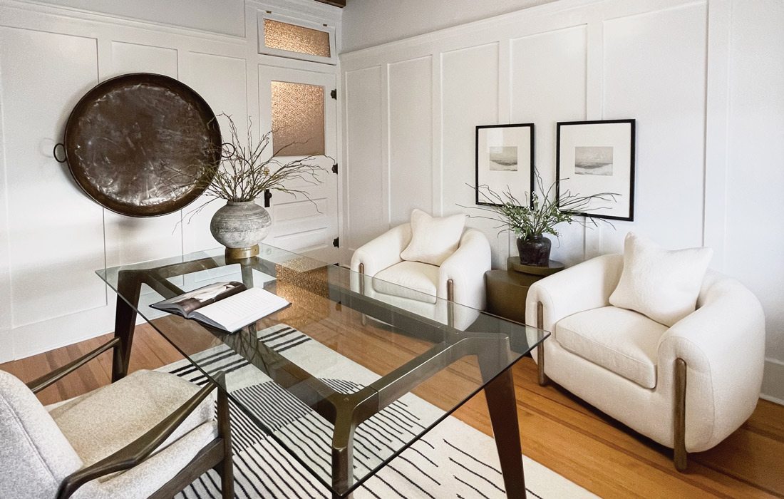
Project Goal: To add historic charm back into a turn-of-the-century office and combine it with modern and rustic pieces to create an inspiring space for an author.
Designer
Beverly Moore, Moore to Love Homes
Builder
Brock Moore, Moore to Love Homes
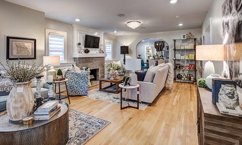
When Beverly Moore, interior designer and owner of Moore to Love Homes, made her first site visit to her client’s outdated loft office, she knew she didn’t just want to modernize it. She also wanted to rewind time.
The office space was for a West Plains–based writer, but lacked architectural charm, which was surprising considering it is within a historic building in downtown West Plains. “It hadn’t been touched probably since the 1950s or 1960s,” Moore says. “It was built in the early 1900s, but it just didn’t have any architectural details that you would expect from that time. So we decided we would just put [those details] back in.”
To breathe life back into the space, Moore added board and batten molding to the walls. This served a dual purpose, which was to add interest but to also provide a convenient surface to hang art since the walls are made of plaster and lathe.
Moore also took the ceiling from basic to captivating by adding a rough-sawn pine ceiling. This created an exposed look that is similar to what you might see if you could peer beneath the plaster.
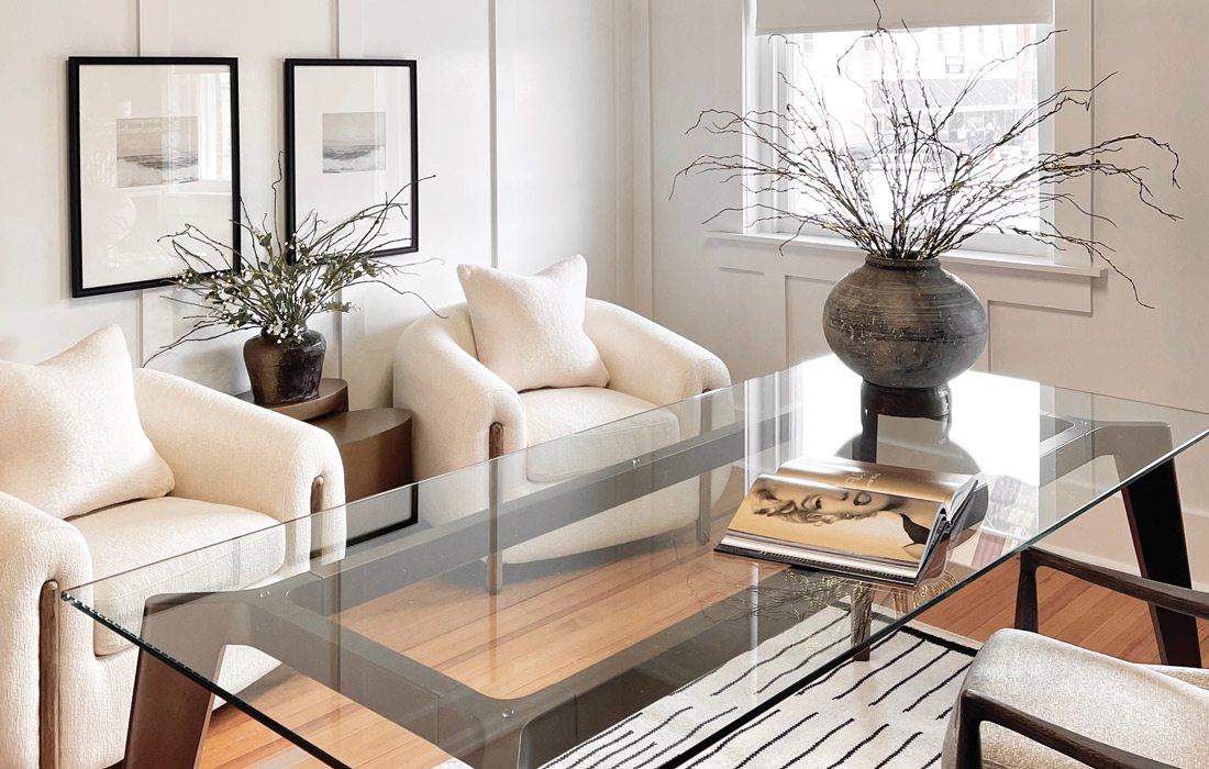

The original hardwood floors were in great shape, and the stain matched the rest of the floors in the downtown office building. So, Moore decided to leave them as-is but chose to decorate with accessories that would downplay any yellow tones in the floors. For example, a white area rug provides a more neutral view when her client sits at her glass-top desk to write.
With a traditional and rustic backdrop, Moore wanted to introduce modern and organic elements to the space through furniture and accessories. Moss and twigs in earthenware pottery invite nature inside, and a metal cooking vessel doubles as an art piece and magnetic board. The transitional furniture features clean lines, but also soft boucle fabric.
“The rooms, they just take on a life of their own after you start adding the client’s taste with it,” Moore says. “It just makes for a much more interesting space when you mix it up.”
RESOURCE LISTINGS
Where to find the looks and materials used to create this winning business space in Springfield, Missouri and surrounding areas.Office Furniture
Moore to Love Homes
417-293-0616
Builder/Contractor
Brock Moore, Moore to Love Homes
417-293-0616

