With their move to the Galloway neighborhood, Springfield-based brand design studio Fried Design Company created the ideal space for cultivating office culture and bringing their own brand to life.
Mar 2024


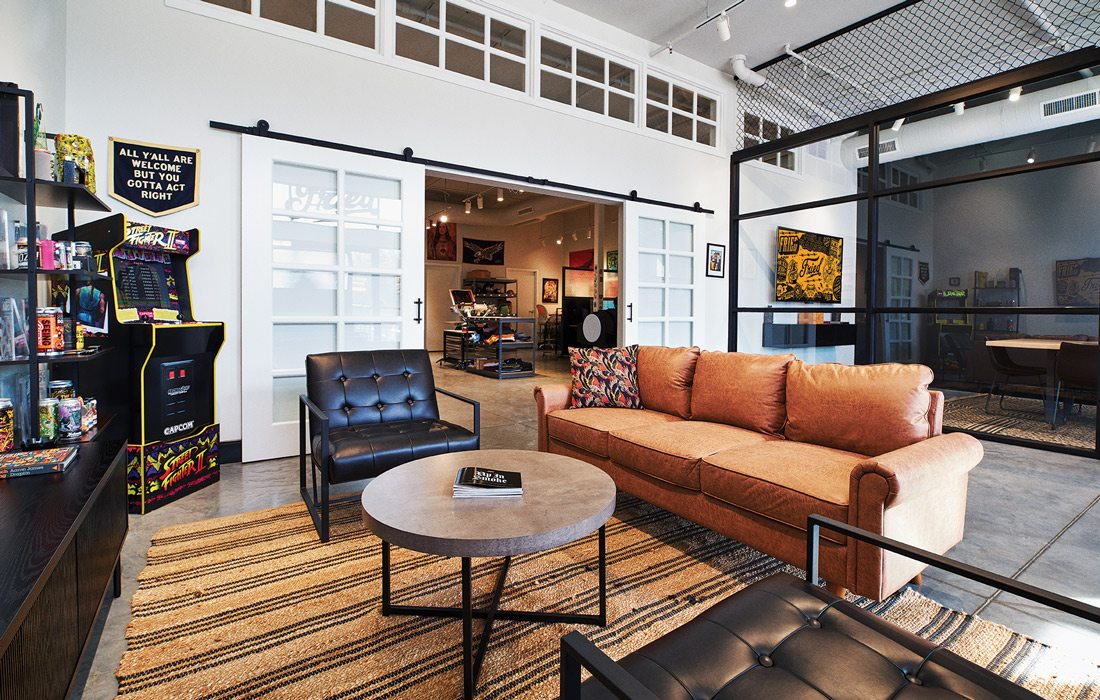
1. Located at the entrance of the workspace, the employee hangout room includes a game console, basketball hoop and lots of extra space. “Our space is built to be super collaborative because it’s important for us all to be able to gather, talk about ideas and opportunities and take breaks,” Fried Design Company Founder Josh Sullivan says.
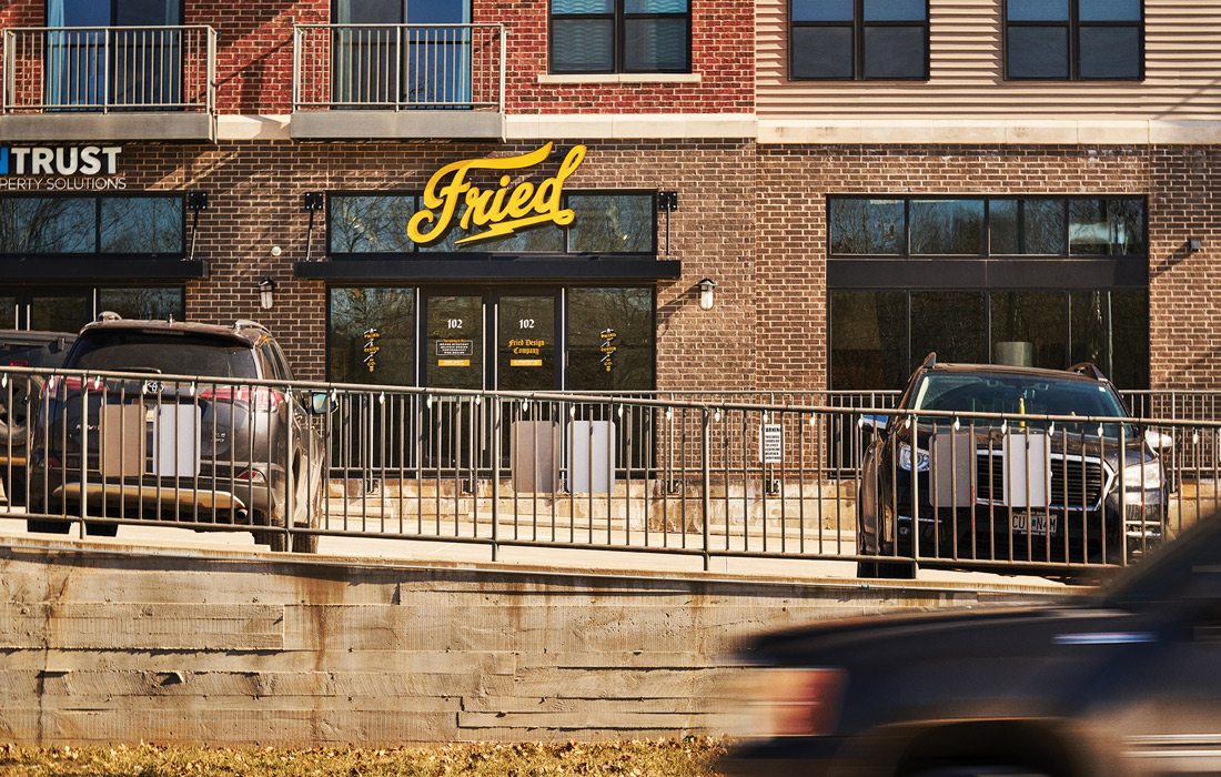
2. Along with the increased capacity for collaboration in the space, Sullivan says one of the biggest improvements they’ve seen has been a result of the location. Being in the Galloway neighborhood, right along the Galloway Creek Greenway trail, allows the team to easily take the office dog for walks and gather for team lunches at nearby restaurants like Galloway Grill and Niji. Beyond being beneficial for employees, Sullivan has also seen it help grow their local business. “From a visibility standpoint, it’s been really cool,” he says. “We’ve had several big, local clients who found us because they were on the trail and saw the sign.”
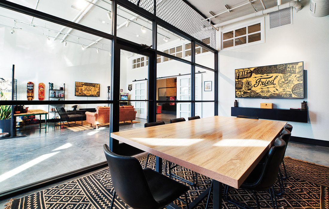
3. The goal for the conference room and extra space is for hosting workshops, teaching classes and holding small events for their clients as the company continues to grow. Regardless of how much growth the company may see in revenue, Sullivan says their goal is to maintain their size. “We’ve made a conscious decision to not grow the size of the company,” he says. “We will always be trying to scale up in clients and not in footprint, I never see us going past 10 employees.”
4. One of the goals of the remodel was to give each team member a workspace that is best suited to their work while also representing their personality. “Everyone’s space is customized for them,” Sullivan says. “People bring in all kinds of weird stuff and hang it up on the walls wherever they see fit so it looks like everyone’s brains kind of collectively exploded on the walls inside the office.”
5. As a team of designers it only makes sense that Fried Design Company would be covered in artwork. Sullivan says the majority of the work adorning their walls is from friends, local artists and their own work. Surprisingly, their art collection also includes work from their competitors. “We’ve gotten really, really close with our competitors, they’re our friends at the same time,” he says. “We all hang out together and go on vacations with people who we bid against every day. So we have a lot of their art on our walls and I’m sure they have a lot of our art on theirs.”
6. What Sullivan refers to as their “analog station” features everything from screen printing to flat stock printing and space for watercolor, drawing and other artwork. “It’s a nice place for the team to escape from the computer and make art with their hands and maybe do something a little more different and unique,” Sullivan says. This area also includes a high end photography studio for their client’s work.