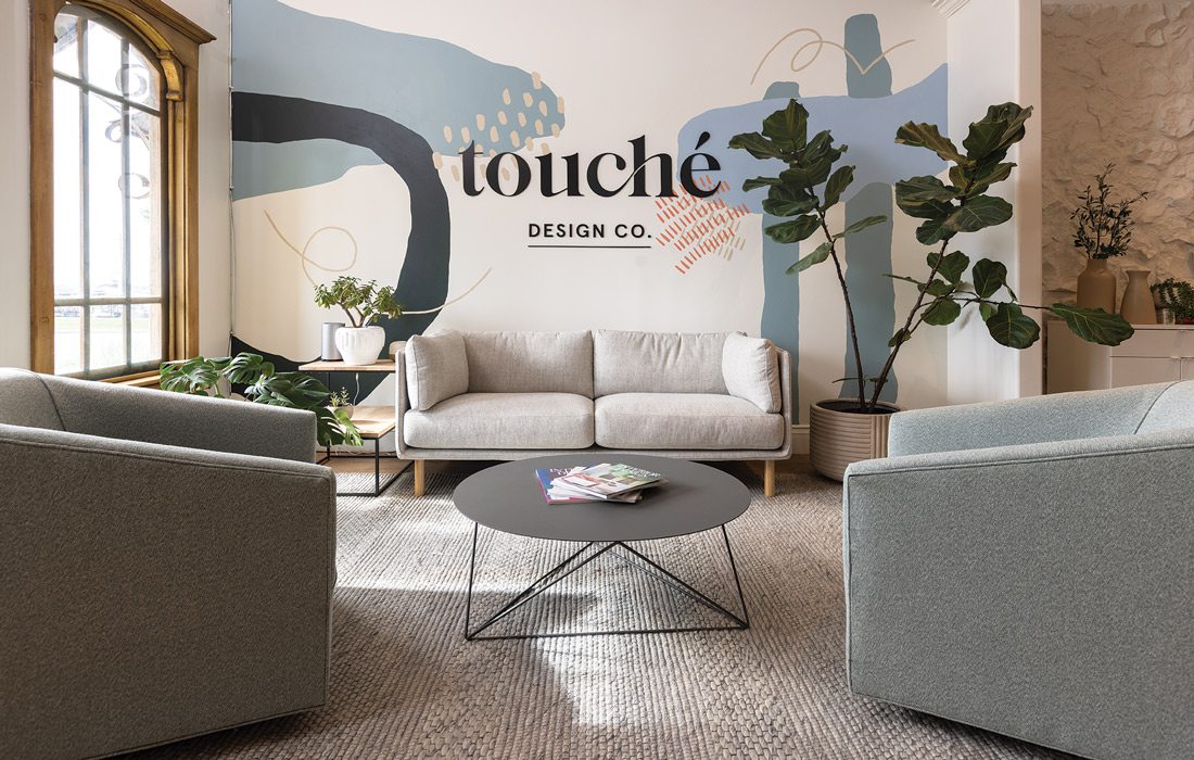
One: Touché Design Co. team took full advantage of being able to showcase its skills to everyone who stepped foot into their workplace.
Purchase PhotoTouché Design Co. brought its office culture and brand to life through the remodel of its workspace. Take a look inside the newly redesigned space.
Sep 2023

Touché Design Co. brought its office culture and brand to life through the remodel of its workspace. The team was able to design the space together and create tangible changes to improve everyday life in the office, maximize space and add inspiration.
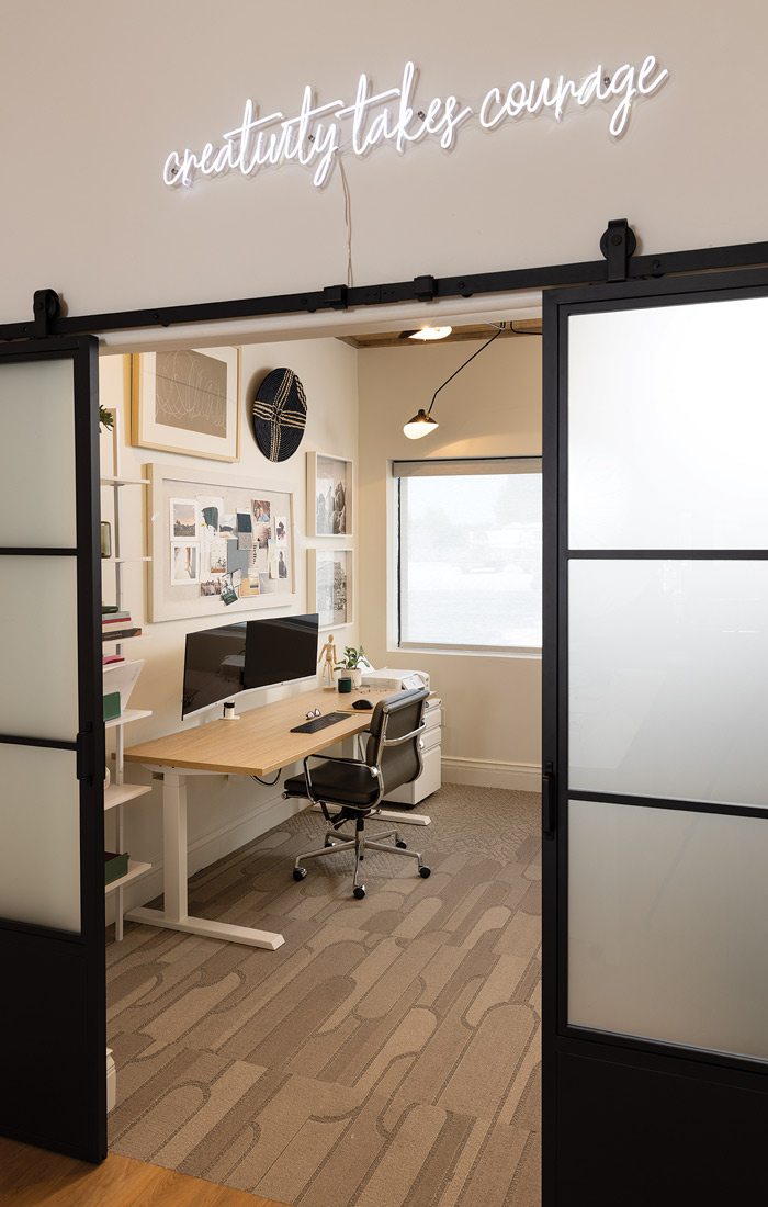
One: Touché Design Co. team took full advantage of being able to showcase its skills to everyone who stepped foot into their workplace.
Purchase Photo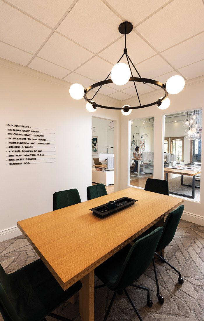
Two: The team went into the project with three main motivators: creating an open office collaboration layout, making the office flow to maximize studio space and bringing in design inspiration.
Purchase Photo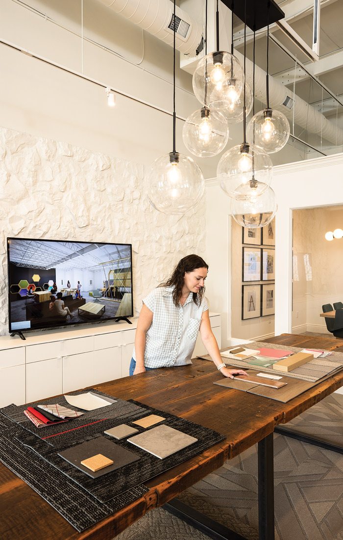
1. While remodeling and redesigning the space, the Touché Design Co. team took full advantage of being able to showcase its skills to everyone who stepped foot into their workplace. Now, clients and other visitors get a firsthand look at the results the team members are capable of, and they get to work in an environment that breathes creativity and inspiration into their craft. “It really has shifted our pride, having this beautiful space to come in and work,” says Ginger Robinson, the company’s president and creative director. “It has defined who we are as a team and given our workplace personality.”
2. The team went into the project with three main motivators: creating an open office collaboration layout, making the office flow to maximize studio space and bringing in design inspiration. “We had a rebrand, and it was time that our space reflected that,” Robinson says. “The space wasn’t serving us well as a team and didn’t have a lot of design inspiration.” To accomplish the project’s goals, they created a better layout for their library of materials and a new lounge for team meetings.
3. In addition to updating their own workspaces, Touché’s team members also created a presentation space for clients. Complete with a new layout and large screen, the new space serves all of their needs for client interactions. For other meetings with the team and clients, they updated the conference room, adding their branding photos and manifesto to the wall. Regardless of which space they were working on during the remodel, the team enjoyed doing what they do best in their own offices. “We had a lot of fun doing this together,” Robinson says. “It was something that we’ve been looking forward to being able to do as a team.”
4. One of the goals of the remodel was to give Robinson a workspace that represented her personality. The team designed and fabricated chairs, filled the space with plants and adorned the walls with Robinson’s photography and paintings. “My new office space has been so useful in giving me a more private space to work that reflects our mission and brand,” Robinson says.
5. While updating the break room, the team members wanted it to showcase their personalities and reflect their lives outside of the office. “On our break room wall, we have this whole collection of Instagram photos, which are people’s personal photos they wanted to put on display of their pets, family and travels,” Robinson says. They also incorporated the design into the function of their office by creating a space for inspiration. “Each week, a different team member selects an inspirational quote that we put on the wall,” she says. “It’s just a cool rhythm that we have incorporated into our new space.”
6. Upon entering the office, the first thing visitors see is the one-of-a-kind mural, designed and painted by the team. “We wanted something that was a hit of color, a little bit of whimsy in our space and something personal to us, meaning it’s not duplicated somewhere else,” Robinson says. “So we put together inspiration for the mural, designed it in software, and then the team painted it on the wall.”