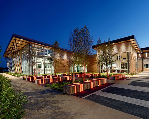
The library isn’t just for students. Spaces here are designed for all community members to celebrate local art, use resources and be creative.
Commercial Design Awards
2018 Commercial Design Awards
Peep the winning office, lifestyle and sustainable commercial spaces that outshine the competition.
By Ettie Berneking
Jul 2018

The true hallmarks of quality design extend beyond aesthetic value. It’s about the functionality, efficiency, ingenuity and collaboration behind the finished product. When local designers and architects shared their recent commercial projects with us for our third annual Biz 417 Commercial Design Awards, we were blown away by the talent and vision. The submissions were sent to judges with ASID Georgia to determine the winners. Three projects stood out among the pack, and although the scope of each varies, a focus on efficiency, flexibility and user experience runs throughout this year’s winning submissions. These projects prove that functionality and quality design go hand in hand.
MEET THE JUDGES

Janie Hirsch
With a father who was both an architect and watercolor artist, Janie Hirsch, founder of Atlanta-based J. Hirsch Interior Design, came into her craft predisposed to creating beautiful visuals. Hirsch graduated from Louisiana State University with a Bachelor of Interior Design from the School of Architecture.

Ann Wisniewski
After graduating from Brenau University, Ann Wisniewski established AJW Designs Inc. with her husband, John, an architect. The firm designs luxury residential and commercial projects nationally and internationally. Her work can be seen on HGTV and in several regional and national publications.

Steve Hart
Steve Hart is a principal at HLGstudio. Having completed numerous high-profile and award-winning projects, he is best known for his ability to connect with the human element of design. Hart has also taught at A.I.U. and Georgia State University and serves on the National Board for ASID as Director at Large.

Edward J. Alshut
Edward Alshut is a founding principal of Studio A2 LLC, an architecture and interior design firm with an award-winning portfolio of commercial, institutional and residential work. Edward is currently an invited mentor at Savannah College of Arts & Design Masters of Interior Design Program.

Dina Peterson
With a degree in Liberal Arts and Sciences from Fischer College and an interior design certification from the QC Design School, Dina Peterson works as a design consultant and stylist for several international companies. She finds ways to be creative in all her professional and personal endeavors.

Maria McLaurin
As the principal of McLaurin Interiors, Maria McLaurin has designed residential interiors throughout the Southeast and won numerous ASID Design Excellence Awards. McLaurin is a graduate of Brenau University with a Bachelor of Fine Arts in Interior Design and has received a Masters of Innovation Award.

Chris Socci
Chris Socci founded C. Socci Inc., a full-service residential and commercial Atlanta-based interior design firm. His work has been recognized with multiple ASID design excellence awards and Modern Luxury Faces of Design 2018. Socci is currently the President of the ASID Georgia Chapter.

Shawn Alshut
Shawn Alshut is a founding principal of Studio A2 LLC, an architecture and interior design firm with an award-winning portfolio of commercial, institutional and residential work. Shawn is a Past President of the ASID Georgia Chapter and is on the board of the Museum of Design Atlanta.
JOPLIN PUBLIC LIBRARY
Category: Lifestyle
Project Leads: James Stufflebeam, Bradd Brown and Pamela Haldiman, Sapp Design Architects
3750 S. Fremont Ave., Springfield, 417-877-9696
Project Summary: Joplin was looking for a new public library building that could grow and adapt to community needs. Sapp Design delivered that and more in this airy and inviting atmosphere.
Project Partners: OPN Architects, RE Smith Construction Co., Olsson Associates, CJD Engineering and Toth & Associates
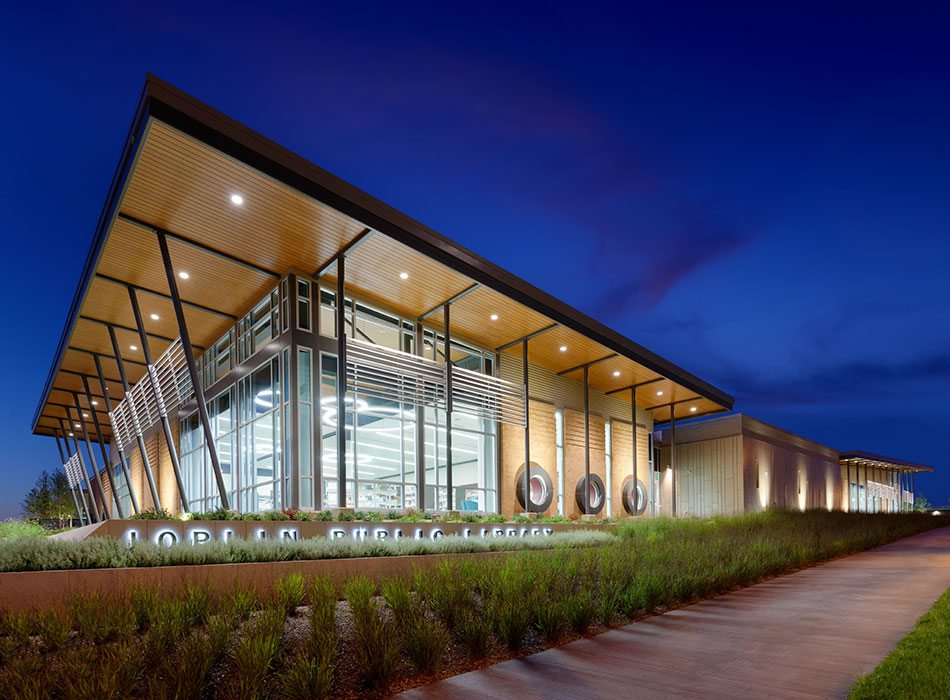
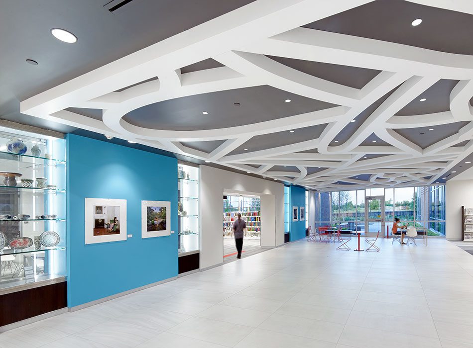
When the Joplin tornado hit in 2011, the mile-wide storm left a wake of destruction along Main Street. As the city rebuilt, new trees, schools and homes rose from the cracked landscape. To celebrate the community’s rebirth, local artists have adorned buildings with images of butterflies. One of the latest buildings to spread its wings is the Joplin Public Library. The new library opened in May 2017. But unlike many of the city’s new structures, the library was not damaged in the storm. “The existing library didn’t have room to grow,” says Ben Sapp, marketing director at Sapp Design Architects. After securing grants from the U.S. Economic Development Administration, the city hired Sapp Design Architects to create a new public library. The building had to be more than a repository for books. It needed to be a public gathering space, an event center, an art gallery, a makerspace and a storm shelter. “Libraries are becoming less focused on their collection of materials and more focused on becoming community centers and creators of content,” says Jim Stufflebeam, vice president of Sapp Design Architects. “There are all kinds of opportunities libraries are moving into, so we needed to provide flexible spaces that could be adapted.”
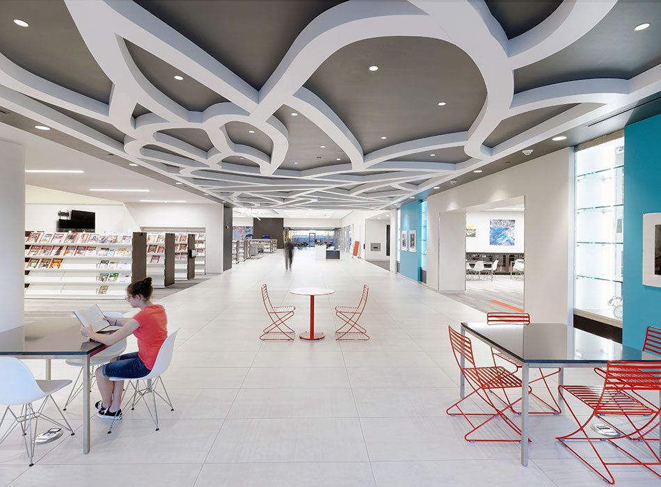
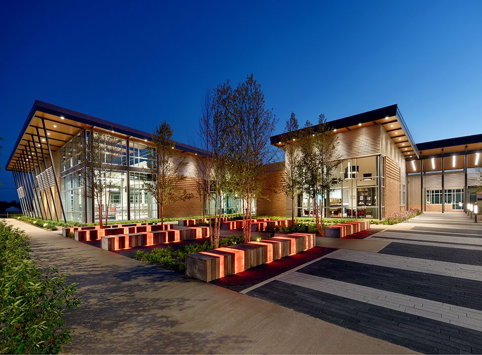
To create a multifunctional building that embraced Joplin’s rebirth, Sapp Design collaborated with nearly 23 groups including: city council, parents, caretakers, the library board and even children. The result is a modern and inviting design with the city’s symbolic butterflies hinted at throughout. The FEMA-rated storm shelter in the middle of the library doubles as a community center with an entrance that serves as a gallery for local artists. The library’s open floor plan allows for maximum visibility while hanging fabric panels create a sense of separation between reading areas. The building is also home to a new makerspace and Joplin’s Post Art Library, a privately endowed special library and art gallery. It also has a new home along 20th Street, and with nearly 40 percent of the building clad in glass, the city is sending a message. “The community made a deliberate decision to not build a bunker,” Stufflebeam says. “They wanted something open and inviting in spite of concern for future weather events.”
Project Resources
Partner Architects: OPN Architects
General Contractor: RE Smith Construction Co.
Civil Engineers: Olsson Associates
Mechanical Engineers: CJD Engineering
Structural Engineers: Toth & Associates
Landscape Architects: Design Workshop
Decorative Paint Contractor: MVP Painting
Carpet: Zickel Flooring
Stone/Tile: MSW Inc. and Midwest Tile & Stone
Wall Coverings: Dreamscape Roysons Corp.
Plumbing Fixtures: Kimberling City Plumbing
Light Fixtures: Joplin Supply Co.
Kitchen Cabinets: MSW Inc.
Audio-Visual Equipment: Sensory Integration
SHERWOOD ELEMENTARY SCHOOL
Category: Sustainable Space
Project Leads: Brad McKenzie, James Stufflebeam and Pamela Haldiman, Sapp Design Architects
3750 S. Fremont Ave., Springfield, 417-877-9696
Project Summary: Sapp Design Architects created Springfield’s first net-zero capable public school with a dual focus on energy efficiency and multipurpose spaces that allow for collaborative learning.
Project Partners: DeWitt & Associates Inc., Olsson Associates, Malone Finkle Eckhardt Collins and Toth & Associates
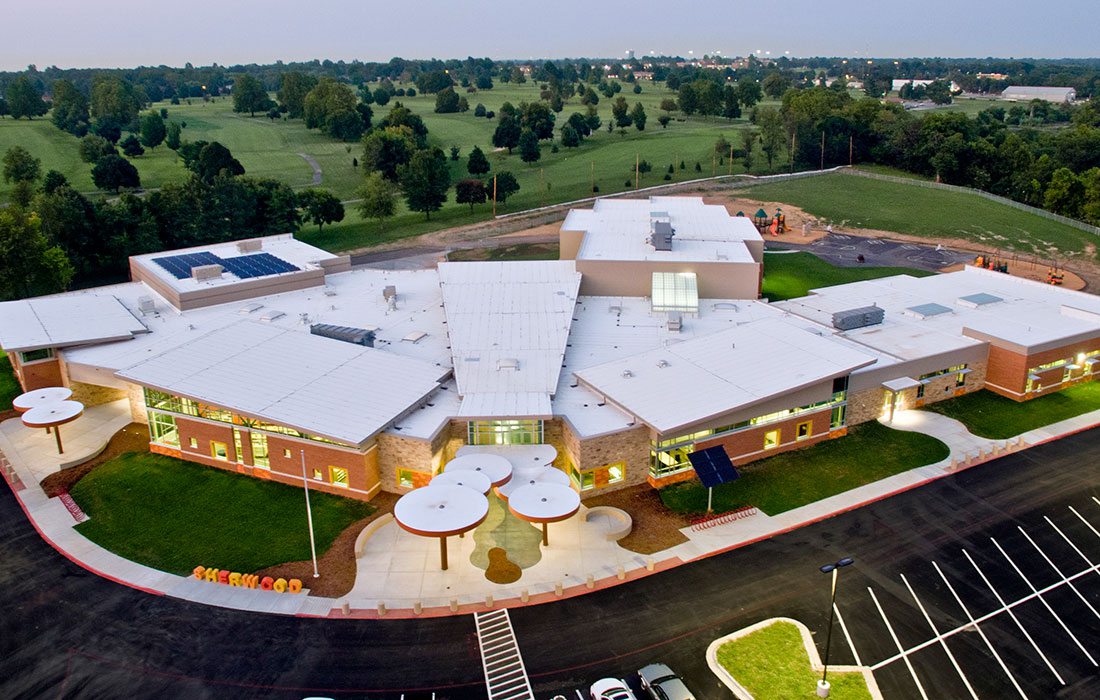
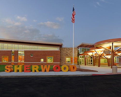
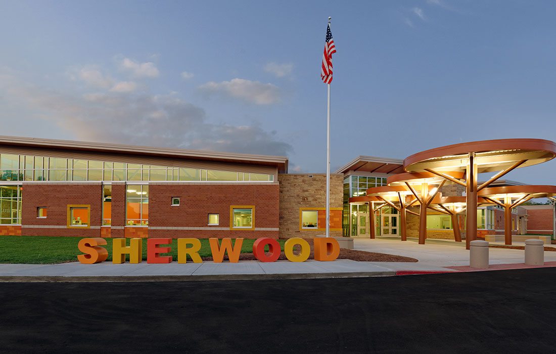
Looking at the new Sherwood Elementary School, you won’t realize just how energy efficient the building really is. But the new nature-themed building is the first public school in Springfield to be net-zero capable. A net-zero building produces more energy than it uses over a year. In the world of energy efficiency, that’s a huge deal, and it’s an even bigger accomplishment for a school where computers, kitchen ovens, overhead lights and even coffee makers can draw a huge amount of energy throughout the day. Three years since opening, Sherwood is already in the top 5 percent of energy use by schools in the country according to Energy Star ratings. But don’t be fooled by the building’s modern and friendly design. Building a net-zero capable school was not easy. In fact, the project threw more than one hurdle at Sapp Design Architects.
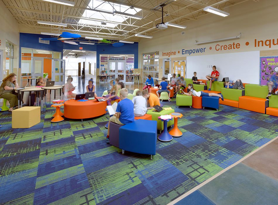
Another aspect of Sherwood’s redesign was the focus on multifunctional spaces like this community area. Skylights let in plenty of natural light, and furniture can be moved and rearranged like Legos to meet classroom needs. Even the small end tables serve another purpose. They might appear to be workspaces, but they can also be stools that swivel. “Furniture is a huge part of collaborative learning,” says Jim Stufflebeam, vice president of Sapp Design Architects. “Kids can fidget and rock without being a distraction, and studies show that kids learn better when they’re kinetic.”
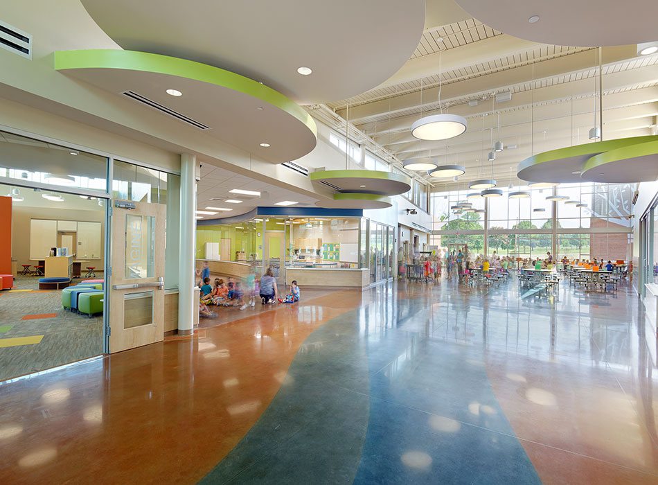
Inside the school, the nature motif is continued with a floor detail mimicking a river and lighting bays that resemble tree canopies. To conserve as much energy as possible, Sapp Design installed different thicknesses of glass to allow in natural light without increasing the building’s internal temperature. They also installed sensors on several of the lights, especially inside classrooms. If enough natural light is present or the room is empty, the classroom lights will turn off.
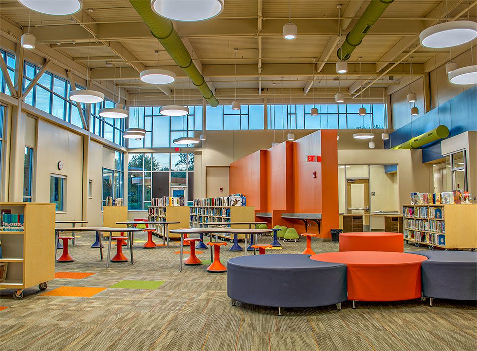
Including solar panels, geothermal wells, skylights and shaded, high-performance windows, Sherwood has numerous devices aimed at increasing the building’s energy efficiency. They’re just hidden. “A lot of these are things you can’t see,” says Brad McKenzie, director of business operations and project manager at Sapp Design Architects. The school’s media center is a good example. Although the windows clearly cut down on electricity needs, what you can’t see is the room’s added insulation. Not only does the structural metal deck ceiling help absorb noise, it also helps insulate the room and control the central temperature.
Project Resources
General Contractor: DeWitt & Associates Inc.
Civil Engineer & Landscaping: Olsson Associates
MEP Engineer: Malone Finkle Eckhardt Collins
Structural Engineer: Toth & Associates
Office Furniture: SSI Furnishings, Virco, HON Company and Indoff
Hardware: H&G Sales Inc.
Plumbing Fixtures: Harry Cooper Supply Co.
Light Fixtures: H.E. Williams Inc.
Cabinets/Countertops: Alpine Wood Products
Kitchen Appliances: Fellers Food Service Equipment
Carpet/Tile: Zickel Flooring
Decorative Paint Contractor: MVP Painting
Audio-Visual Equipment: Sensory Integration
EFCO CORPORATION HEADQUARTERS
Category: General Office & Professional Services
Project Leads: Marie Gervais and John Dodd, Buxton Kubik Dodd Design Collective
3100 S. National Ave., Suite 300, Springfield, 417-890-5543
Project Summary: Buxton Kubik Dodd transformed a local manufacturer’s run-of-the-mill office into a dynamic, inviting environment that showcases its products while providing spaces for collaboration and privacy.
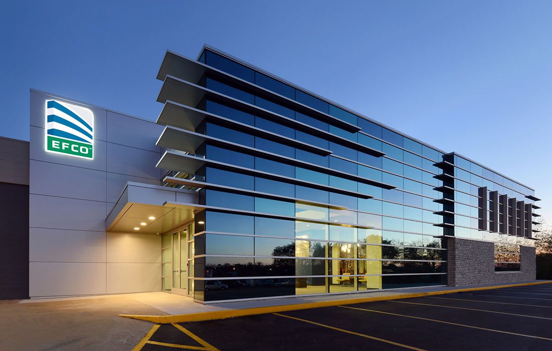
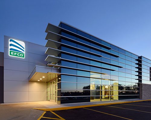
When this 417-land business outgrew its existing office space, designer Marie Gervais, with Buxton Kubik Dodd Design Collective, was faced with a challenge: how to create an open office that met the vastly different needs of multiple departments. To create an updated office EFCO could use for client meetings, she incorporated several of the architectural aluminum window, curtain, wall and entrance systems the company is known for manufacturing. These same products helped Gervais establish new collaborative workspaces while also providing privacy.
Biz 417: What was the strategy for providing more open space inside?
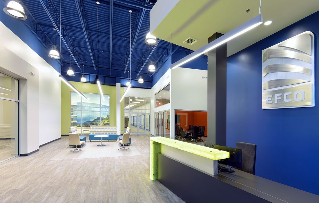
Marie Gervais: Prior to the renovation, the company had grown organically within the space. The heads of departments had private offices, but the offices were not necessarily in proximity to their workforce. We eliminated a lot of private offices and limited those to the positions that required a level of privacy not easily obtained in an open office environment. We also created a number of touch-down rooms for collaborative inter-department meetings and client meetings. We opened up the main entrance to create a large dynamic lobby with two adjacent formal conference rooms.
Biz: It’s pretty neat that you included EFCO products. Can you point out some specific features manufactured by the company?
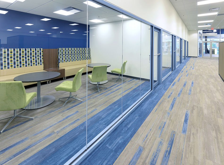
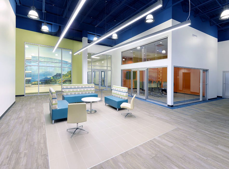
MG: Every interior glass wall is made from one of their products, and we even incorporated their curtain wall in the lobby. We also created display areas with large scale images of EFCO projects framed by EFCO glazing systems. The idea was they would be able to point out the various examples to clients.
Biz: What was the thought process for leaving the metal ceiling exposed?
MG: Leaving the metal ceiling exposed helped the space feel more modern and open, and it tied in with the look we were going for. While most facilities paint an exposed deck in white or black, we wanted to soften it in a big way, and in a way, make it more dramatic. The blues and greens used throughout the interior are a nod to the corporate colors, and we felt that the use of blue would really make the space pop.
Biz: What was the design inspiration for the exterior?
MG: We wanted to advertise the company by featuring some of EFCO’s most innovative curtain wall systems and make a real statement for the company. The curtain wall system, like the interior glazing system, is intended to be a sort of demonstration tool for prospective clients. We also played with glazing tints to echo the corporate logo.
Biz: What design elements did you include to foster a collaborative workspace?
MG: The staff at this EFCO facility is divided into various departments that each work in very different ways. We tried to address their various needs, from the highly collaborative, high-energy needs of the specialty department to the quiet and relatively solitary work of the engineering department. We created islands of storage that created collaborative layout space in some areas and played with panel heights and configurations.
Biz: How do you balance a welcoming and comfortable workspace that provides enough privacy with a more transparent and collaborative environment?
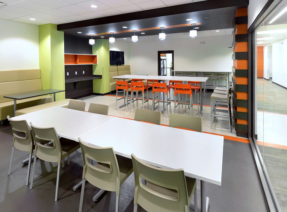
MG: We focused our energy on certain areas around the buildings including the lobby area and the break room. We used bright accent colors to help with atmosphere and added casual gathering places throughout the office. We also used furniture to subdivide the open office.
Biz: What were some of the challenges you faced when creating and then executing this new design?
MG: I think one of the principle challenges was to balance the wildly different needs of each department with the open office concept. We wanted to make sure that the staff had access to various types of spaces that would fulfill their needs.
Project Resources
Office Furniture: Grooms Office Environments and Indoff
Plumbing Fixtures: American Standard
Millwork: K.S. Wood Products

