Offices
Inside Andrea Deckard’s Fuchsia Workspace
Interior designer Andrea Deckard has an office that matches her design style: clean and modern with splashes of personality to boot.
By Rose Marthis
Sep 2018

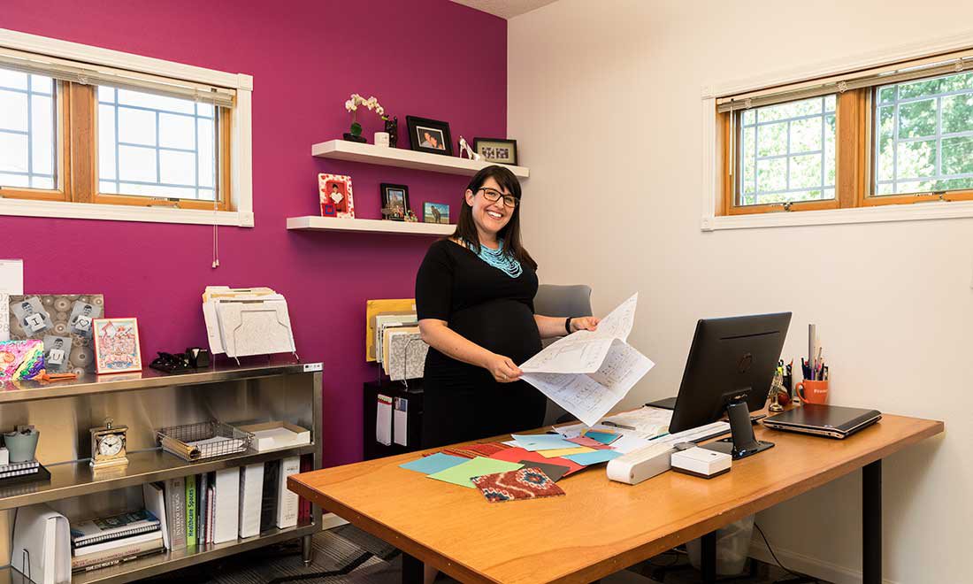
1. When Andrea Deckard moved her business from Nixa back to Springfield in 2015, she knew she wanted a fresh, bright hue as an accent color. She landed on fuchsia. “I love fuchsia; it’s fun and playful,” she says. The color is used throughout the office and makes a bold statement on the wall behind her personal space. She keeps current project folders accessible because she must have them where she can see them, she says. The interior designer has made a name for herself in commercial design, especially in the hospitality industry. You can see her work in new Springfield destinations such as the Vib Hotel and Los Cabos Mexican Grill and Cantina.
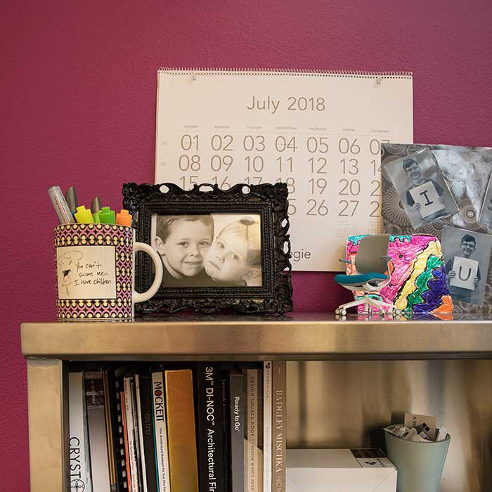
2. The mix of professional and personal is evident on Deckard’s bookcase as well. She keeps books and product catalogs of her favorite manufacturers on her shelves for quick reference. On the top shelf, she has a mix of family photos, art from her kids and more client gifts, including the mug a tile representative gave her. The mug reads, “You can’t scare me, I have children.” “I form good relationships with my clients, and they turn into friendships,” Deckard says.
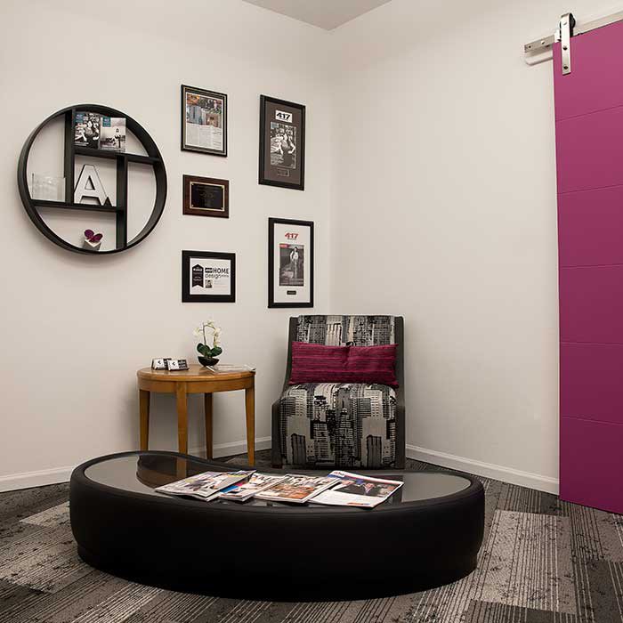
3. Deckard showcases her awards and profiles from local publications on her reception area walls, and Deckard rotates the accomplishments as new ones come in. The furniture used here shows examples of some of her design work. This chair was a sample from a hotel project that she had reupholstered in a neutral patterned material to match her office. The coffee table was a custom order with a faux leather wrap and glass drop-in. “It’s the most modern piece I own,” Deckard says.
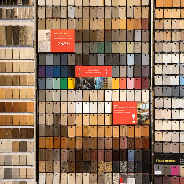
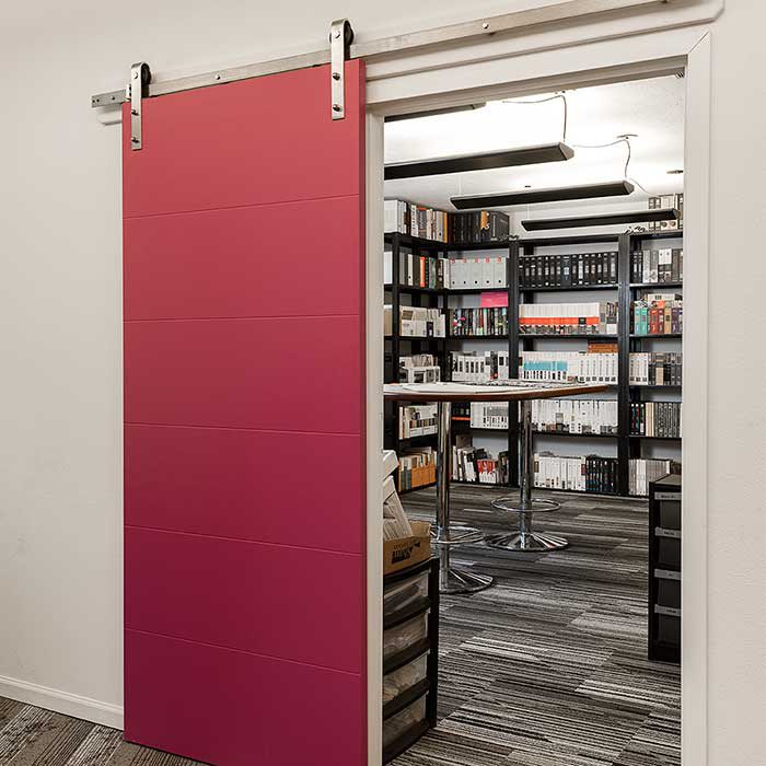
4. Deckard makes it a point to know how materials are made so she knows the best way to use them in her work. In the library hang dozens of samples of plastic laminate, which is actually layers of craft paper and resin pressed together beneath a protective layer. Deckard uses it in places that hardwood isn’t as practical, such as surfaces that need high moisture resistance. “Function is always my primary goal,” Deckard says.
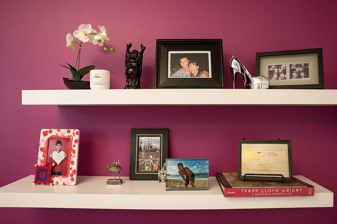
5. The shelves behind her desk showcase some of Deckard’s favorite things and sources of inspiration. She displays photos of friends and family vacations among gifts from friends and clients, such as the white votive a client brought her back from Ireland. Orchids are a common theme in Deckard’s office, popping up here, on the conference table and in photos of her wedding bouquet. “I love orchids,” she says. “[They’re] simple, clean, modern—fits my office.” Deckard is also a fan of Frank Lloyd Wright’s architecture and has toured some of the projects he has designed. Atop the portfolio book sits a piece of her family history: a business license from a family business. Her dad gave her the heirloom when she opened her business in 2002. It was originally her great grandfather’s, and Deckard says she comes from a family of entrepreneurs.
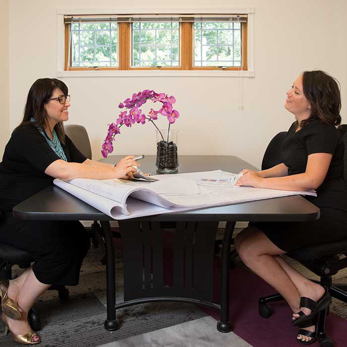
6. The conference table is located in the main area seen immediately as you walk into Deckard’s office. Deckard and her associate, Abby Taylor, use the conference table to collaborate on projects in the office or to meet with clients and sales reps.
7. The barn door is the closest you’ll see fuchsia to the library—Deckard purposely left all surfaces white in the library to prevent reflections and skewing when she’s choosing colored finishes. One of her biggest needs when she was relocating offices was adequate storage, so the tall shelves are necessary to hold all her sample catalogs. The doors were originally oak swing doors and Deckard was toying with the idea of having no doors at all. But she took the design opportunity to create a modern feature that ties together the accents of her office.

